
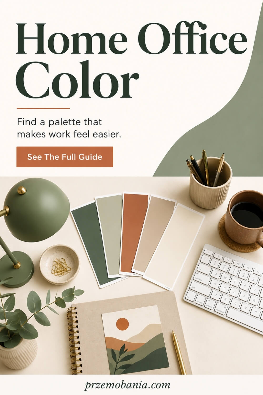
Home Office Color
Could the colour surrounding your desk be helping you settle into work, or quietly making every hour feel harder than it needs to? Home office color can shape how your workspace looks, feels, and functions throughout the day.
If you have stared at paint cards until every shade starts looking the same, or worried that one wrong choice will make your office feel cold, dark or distracting, I know why this decision can feel much bigger than “just paint”.
There is no single best home office colour. The strongest choice fits your work, daylight, room size and personal response to colour. Soft blues, greens and warm neutrals can feel calm, while deeper or warmer tones add energy, but lightness, saturation and contrast can matter just as much as hue.
I am a passionate blogger whose life changed when chronic illness changed my wife’s life, and the love of interiors my mum planted in me as a child eventually became something practical: I helped my wife shape a home workspace around comfort, light and the realities of working from home, while building my own cosy office into the place where I write, create and earn through blogging; alongside everything I have learned through living with these rooms and loving home décor, I have included the sources I used at the bottom of this article because I still keep reading, testing ideas and expanding what I know rather than pretending experience means I have nothing left to learn.
Here is something I wish more colour guides explained: a colour is not simply “blue”, “green” or “beige”. Systems such as Munsell describe colour through hue, value or lightness, and chroma, which relates to saturation, and a 2025 home-office study testing 12 wall-colour variations with 51 participants found that colours with similar value and saturation could create similar perceptions even when the actual hues differed.
It becomes even more interesting when you look at newer research: a 2026 Scientific Reports experiment found significant differences in proofreading performance across four workspace colour conditions, while yellow and blue produced more positive emotional responses and red was associated with more annoyance and anxiety. But the researchers were careful not to turn those findings into a magic paint formula because hue and luminance could not be separated in that experiment, which is precisely why I will never tell you that painting your office blue automatically makes you productive.
If you are still shaping the room around these choices, my guide to making the whole workspace work together will help you connect your palette with lighting, layout, furniture, comfort and the way you actually use your office.
- How Home Office Color Actually Works in a Real Workspace?
- How Home Office Color Changes the Way a Room Feels?
- How Home Office Color Can Support Focus, Comfort and Productivity?
- How Home Office Color Can Make Daily Work Feel Easier?
- How Home Office Color Can Evolve With Your Life?
- Final Word on Home Office Color
How Home Office Color Actually Works in a Real Workspace?
So rather than starting with a fashionable shade somebody used in a beautiful photograph, I start with the room itself and ask what that room is already telling me. The direction of the windows, amount of daylight, flooring, desk finish, shelving and even the colour of the computer equipment can completely change how a paint sample feels once it leaves the shop.
Natural daylight changes in both strength and colour temperature throughout the day, which is one reason the same painted wall can look surprisingly different at breakfast, lunchtime and late afternoon. A north-facing room in the UK often receives cooler, more indirect daylight, so some pale greys and blue-based whites can feel colder than you expected, while warmer neutrals, muted clay tones or gentle greens can make the room feel more settled.
A bright south-facing workspace can usually tolerate stronger or deeper shades because it receives more generous daylight, although intense colours may also look considerably more vivid when sunlight hits them. This is why current guidance from major paint manufacturers repeatedly recommends judging colour in the actual room rather than trusting a screen, catalogue photograph or tiny printed swatch.
Existing finishes matter just as much because your wooden floor, white desk, black monitor, beige carpet or oak shelving all carry undertones that sit beside the wall colour every single day. I have learned that ignoring those fixed elements is one of the fastest ways to create a room where every individual item looks attractive but nothing quite feels as though it belongs together.
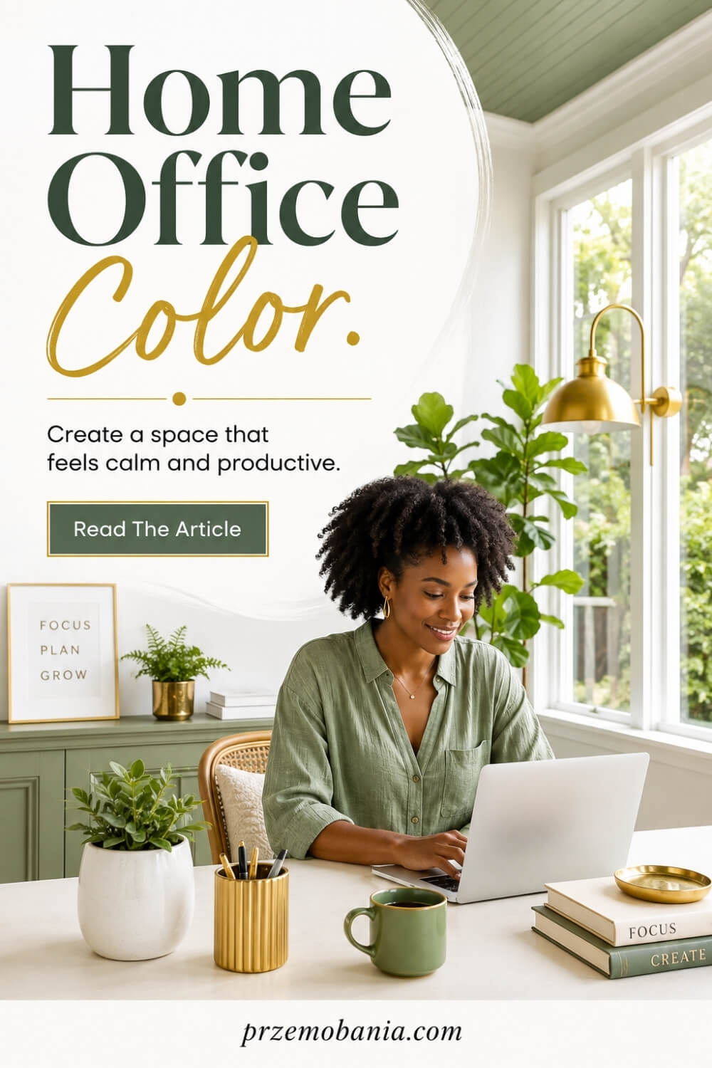
Saturation matters too, and I think it is one of the most overlooked parts of choosing a home office color because two greens can produce completely different rooms even though both are technically green. A dusty sage can sit quietly behind your working day, while a highly saturated emerald may become the strongest visual feature in the room, which can be wonderful for one person and exhausting for another.
Contrast deserves the same attention, especially around the desk where your eyes repeatedly move between a bright screen, darker furniture and the wall behind it. If the differences are extreme, the workspace can feel visually harsh, whereas a more controlled relationship between wall tone, desktop, monitor and surrounding surfaces can make long working sessions feel much easier on the eyes.
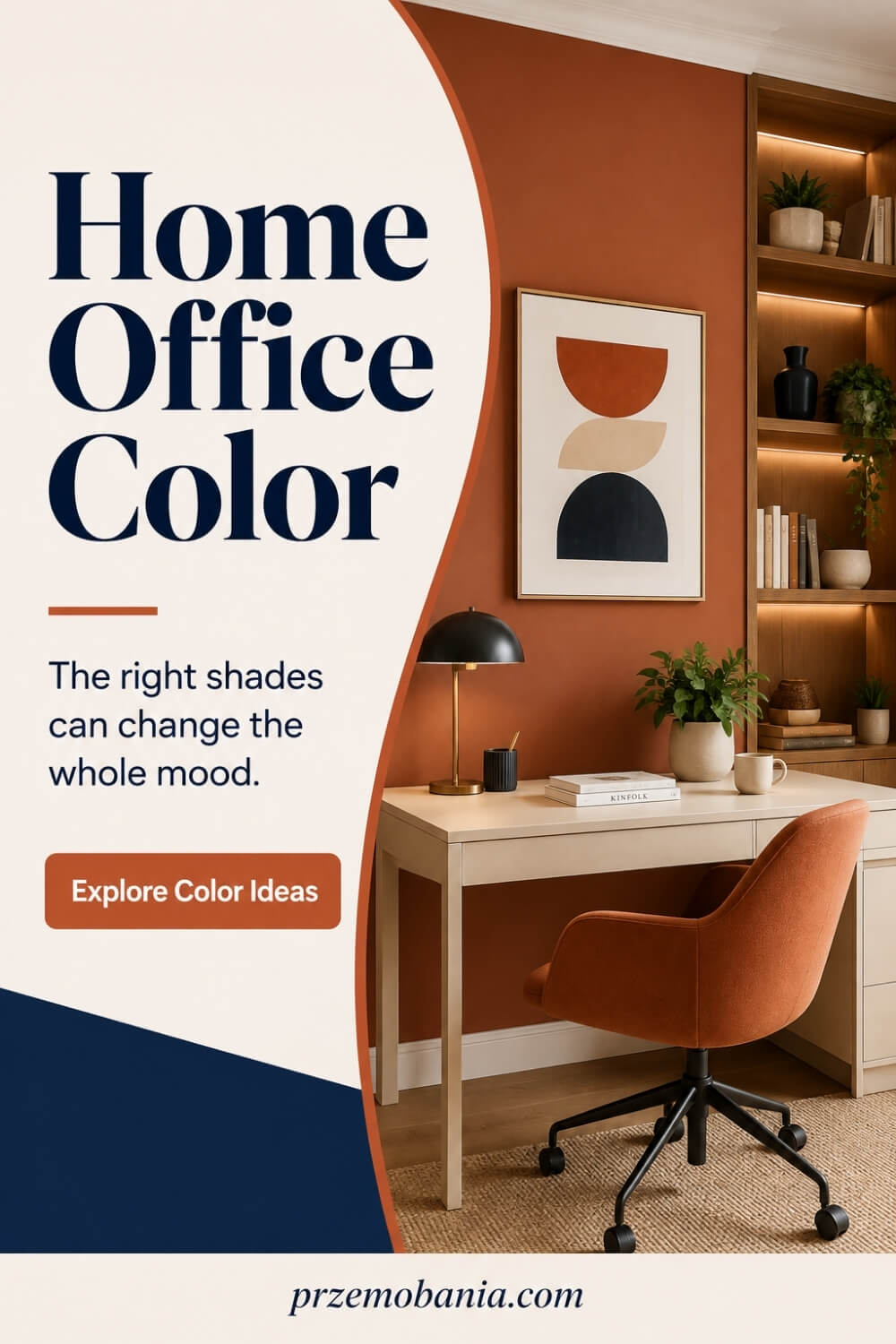
The type of work you do should influence the palette as well because somebody writing quietly for six hours needs something very different from somebody filming content, drawing, designing or meeting clients on video calls. Deeper navy, olive, charcoal and brown can create an intimate, study-like atmosphere, while softer blue, sage, warm white, greige and muted beige can give the room more visual breathing space.
Shared rooms need another layer of thinking because your office may also be a bedroom, living-room corner, landing, dining area or spare room. In those situations, I prefer colours that clearly define the working zone without making the rest of the space feel as though somebody dropped an office into the middle of your home.
Paint finish can alter the result again because matt surfaces absorb and scatter light differently from finishes with more sheen, while practical areas around shelving, doors and frequently touched surfaces may need greater durability. Before committing, I always prefer testing a generous sample beside the actual desk and watching it during several parts of the day rather than making a decision under artificial shop lighting.
That little bit of patience can save you from repainting an entire room because the sophisticated mushroom shade you loved online suddenly looks pink beside your flooring at home. Choosing a successful office palette is therefore less about discovering a universally productive colour and much more about creating the right relationship between light, undertone, saturation, contrast, materials and the person who has to live with that room.
I became much more sensitive to these details when my wife’s health made working from home something she genuinely depended on rather than simply preferred. There were days when I could do very little about what her body was putting her through, but I could make sure the room waiting for her did not feel clinical, chaotic or like another place demanding something from her.
That changed the way I decorate completely, and it is why the practical choices below matter to me so much. They are small decisions, but when you spend hundreds or thousands of hours inside one workspace, small decisions have a habit of becoming part of your everyday life.
- Read the room before choosing paint
- Test colours through changing daylight
- Match undertones with fixed finishes
- Control contrast around your screen
- Use colour saturation with purpose
- Match the palette to work
- Design small workspaces intentionally
- Carry colour beyond the walls
- Build a palette you enjoy
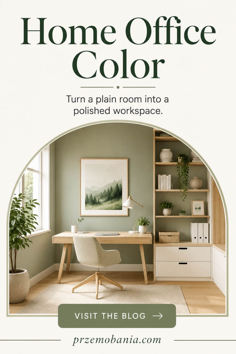
Read the Room Before Choosing Paint
Before I look at a paint chart, I look at the room as it already exists. I notice where daylight enters, which walls stay in shadow, what colour the floor carries, how much dark furniture is present and whether the room feels open or boxed in. Those details tell me far more than a trendy palette ever could.
A small north-facing office with dark flooring may need more visual lift than a sunny room with pale timber and large windows. I also pay attention to what cannot easily be changed, such as built-in storage, carpet, radiators or a large desk. These fixed elements become part of the palette whether you planned for them or not.
This simple habit has saved me from expensive mistakes. Instead of asking, “What colour do I like?”, I ask, “What does this particular room need?” That one question shifts the decision from decoration for decoration’s sake to designing a workspace that actually supports the way you want to feel while you work.
Test Colours Through Changing Daylight
A paint sample that looks perfect at 9 a.m. can feel completely different by late afternoon, which is why I never judge a colour once and call the decision finished. Daylight changes direction, strength and warmth as the hours pass, and artificial lighting takes over when the sun drops. Your walls respond to all of it.
I like to test a generous sample in more than one place, especially near the desk and on a wall that receives less light. I then check it in the morning, around midday and again in the evening with the lamps I actually use. A cool grey may suddenly look blue, while a warm white can become creamier than expected.
This takes a little longer, but repainting takes far longer. When my wife spends hours working from home, I want the room to remain comfortable beyond the one beautiful moment when the sun happens to make everything look perfect.
Match Undertones With Fixed Finishes
Undertones are where many otherwise beautiful rooms quietly go wrong. A beige can lean pink, yellow or grey, a white can feel blue or creamy, and timber can carry orange, red or ashy notes. Put clashing undertones beside each other and the room may feel unsettled even when you cannot immediately explain why.
I compare paint directly with the finishes that will stay in the room, especially flooring, desk surfaces, shelving, curtains and larger upholstered pieces. If your oak desk is warm and golden, a very cool wall colour may create more contrast than you intended. Sometimes that contrast is attractive, but I want it to be deliberate.
I learned to stop choosing colours in isolation because a room is never viewed one sample at a time. You experience everything together. When the undertones cooperate, even inexpensive furniture and simple paint can look much more considered, and your workspace begins to feel calm instead of accidentally mismatched.
Control Contrast Around Your Screen
The wall behind your monitor deserves more thought than it usually gets because your eyes move between that surface and a bright screen for hours. Very harsh contrast can make the work zone feel visually aggressive, particularly in a dark room with a bright display or when a brilliant white wall sits directly behind black equipment.
I prefer to soften that relationship rather than eliminate contrast completely. Mid-tone neutrals, muted greens, soft blues or warm greys can create a gentler backdrop, while good ambient lighting helps prevent the monitor from becoming the only bright object in the room. I also avoid positioning glossy decorative surfaces where they reflect lamps or windows back towards the screen.
This is not about turning your office into a laboratory. It is simply about noticing what your eyes are repeatedly dealing with. A workspace can be stylish and still feel easy to look at, and after long blogging days I value that comfort far more than a dramatic photograph.
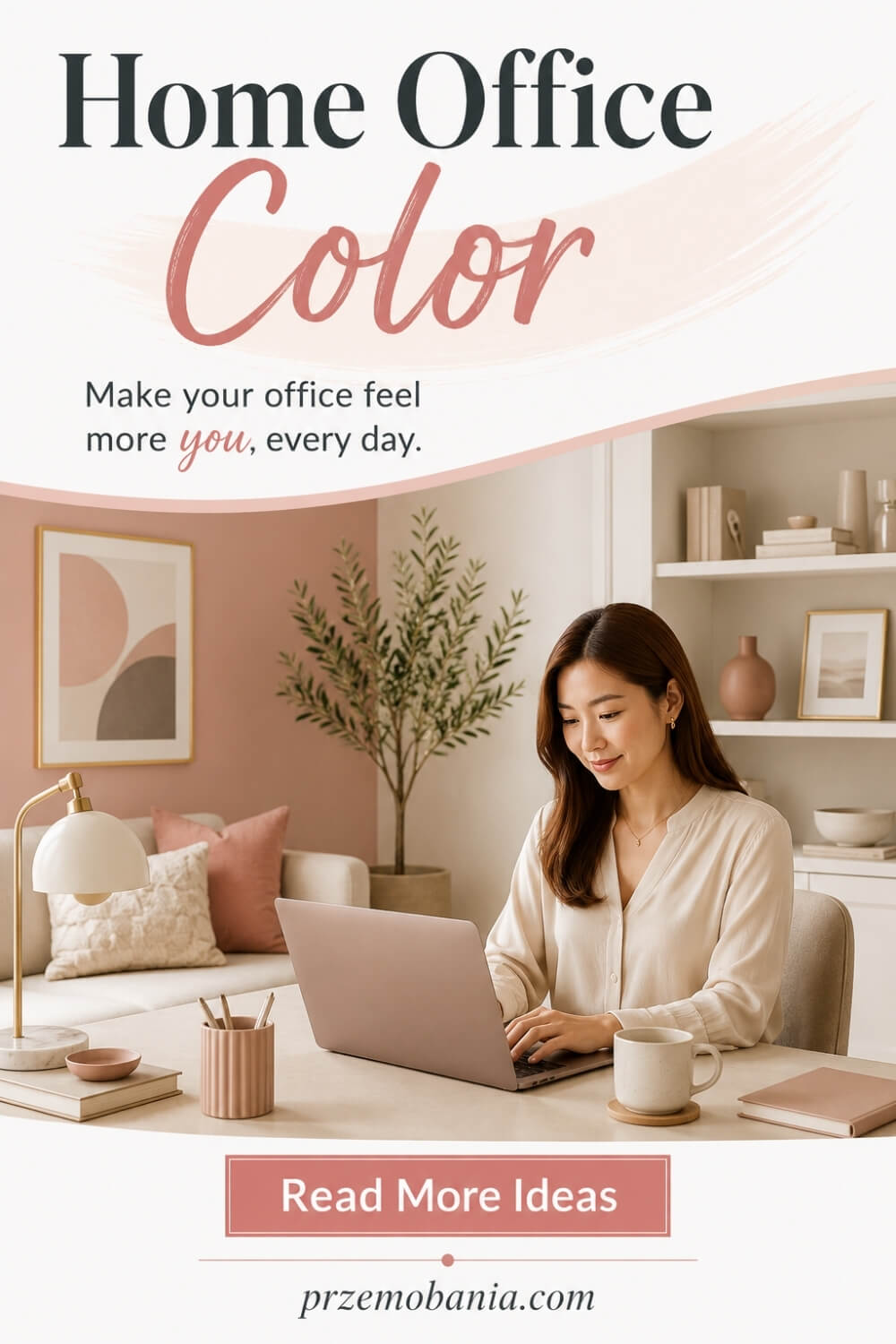
Use Colour Saturation With Purpose
Saturation controls how intense a colour feels, and that can completely change the personality of a workspace. A muted olive and a vivid grass green belong to the same broad colour family, yet they create very different levels of visual energy. I choose between them according to what the room needs rather than assuming one hue always produces one mood.
If I want the office to feel quieter, I usually lean towards softened, greyed or earthy versions of a colour. If the room feels flat, a richer shade on one wall, cabinetry or a smaller feature can bring it to life without overwhelming the whole space. The stronger the colour, the more carefully I consider how much surface area it will cover.
I have made the mistake of loving a bold sample and forgetting how powerful it becomes across four walls. Now I treat intensity like seasoning. You can always add more personality through accessories, art and storage, but living inside too much colour is harder to ignore.
Match the Palette to Work
Your workspace should support the work you actually do, not the fantasy office somebody else photographed. If you spend most of the day writing, analysing or handling detailed tasks, you may prefer a calmer background with fewer visual interruptions. If your work is creative, client-facing or content-led, stronger colour may help the room feel more expressive and memorable.
I also think about video calls and photography. The wall behind you becomes part of what other people see, so skin tone, lighting and background contrast matter more than they would in a private study. A very bright colour can dominate a camera frame, while a restrained shade can allow you, your desk and your work to remain the focus.
My own office has to help me write, design, plan and earn from home, so I care about both comfort and presentation. The best palette is not the one with the fanciest colour name. It is the one that makes your daily work easier to begin and easier to stay with.
Design Small Workspaces Intentionally
Small workspaces can handle colour beautifully, but I am more deliberate about where I put it. The old rule that every small room must be painted white is far too simplistic. A deeper tone can create a cosy, defined working corner, while a light palette can help a cramped area feel more open if that is what you need.
What matters is visual continuity. Using a similar wall and storage colour can reduce the number of hard breaks your eye has to process, while painting awkward built-ins to blend with the walls can make them feel less bulky. In a desk nook, even one carefully chosen backdrop can separate work from the rest of a living room without adding another piece of furniture.
I love this approach because not everyone has a spare room to convert into an office. You may have one wall, one alcove or a corner beside the sofa. That does not make your workspace less worthy of design. Intentional colour can give even a tiny area a sense of purpose.
Carry Colour Beyond the Walls
Paint is only one part of the palette, and sometimes it does not need to be the main part at all. If you rent, dislike repainting or simply want more flexibility, colour can come through a desk chair, rug, curtains, storage boxes, shelving, artwork or even the finish of your desk. These layers can completely change the atmosphere without touching every wall.
I usually repeat a small number of tones across the room so the scheme feels connected rather than random. A muted green wall might reappear in a cushion or file box, while warm timber can be echoed through frames, shelves or lamp details. Repetition creates rhythm, but it does not mean everything has to match perfectly.
This is especially useful when your tastes change. I would rather replace a few accessories than repaint an entire office every time I want a different feeling. Building colour in layers gives you freedom, and a home workspace should be able to evolve as your work, routine and life evolve too.
Build a Palette You Enjoy
Colour advice is useless if it leaves you with a room you do not like. Research can suggest patterns in how people respond to colour, and design rules can help you avoid obvious clashes, but personal preference still matters because you are the one sitting in that office day after day. Your reaction to a shade cannot be copied from somebody else’s mood board.
I start with colours I am naturally drawn to, then refine them according to the room, light and furniture. If you love navy but fear it will make a small office too dark, perhaps use it on cabinetry or one focused area rather than abandoning it. If beige feels dull to you, no amount of trend forecasting will make you suddenly enjoy living with it.
I have learned that comfort is visual and emotional. My wife’s workspace had to feel like somewhere she could belong on difficult days, not somewhere designed to impress strangers online. Your office deserves the same honesty. Choose a palette that makes you want to return to the room.
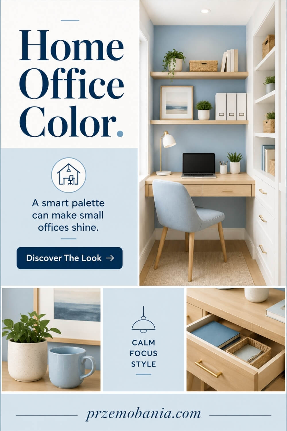
How Home Office Color Changes the Way a Room Feels?
Once you have chosen a palette that suits the room, the next thing I want you to notice is how that palette changes the way the space feels when you actually live and work inside it. This is where home office color stops being a decorating decision and starts becoming part of your daily experience.
A dark wall can make a large office feel more enclosed and private, which can be comforting when you need concentration, while pale colours can give a small room more breathing space when you already feel boxed in. Warm shades can make a workspace feel more welcoming, while cooler shades often create a cleaner, quieter impression, but neither approach is automatically better because your response matters more than a design rule.
I also pay attention to visual weight because darker colours tend to make surfaces feel heavier and more dominant. If your desk, shelving and flooring are already dark, adding another deep shade across every wall may make the room feel visually dense, whereas balancing those elements with lighter surfaces can help the eye rest.
This became far more important to me after watching my wife work from home on days when simply getting through her working hours demanded more from her than anyone on a video call could see. I could not remove what she was feeling physically, but I began to understand that I could remove unnecessary visual noise, harshness and clutter from the room surrounding her.
There is something deeply humbling about adjusting a lamp, moving a desk or reconsidering a wall colour because the person you love needs the room to ask less of her. Those small decisions may look insignificant from the outside, but when somebody spends much of her life working in the same space, the environment becomes part of how that day feels.
I started favouring palettes that created clear places for the eye to settle rather than filling every surface with a competing statement. A quieter wall behind the desk, warmer materials within reach and controlled accents elsewhere allowed the room to feel designed without constantly demanding attention.
I also learned that comfort does not mean removing personality. My wife still deserved a workspace that felt beautiful and grown-up, not a bland room stripped of character simply because comfort mattered.
That is the balance I now chase whenever I design an office: enough colour to give the space identity, enough restraint to let the person inside it breathe. When you approach your own room in that way, you stop asking which shade is fashionable and start asking a much more useful question: what kind of room will make tomorrow’s working day feel a little better?
How Home Office Color Can Support Focus, Comfort and Productivity?
A beautiful workspace should do more than look impressive for a photograph because you have to live with it for hours at a time. I think the best home office color choices are the ones that quietly support the type of concentration, energy and comfort your working day requires.
When I am writing for long stretches, I prefer a room that does not fight for my attention every few seconds. Too many highly saturated surfaces, strong patterns and competing accent colours can make an office feel busier than the work happening inside it.
That does not mean productivity requires pale walls or a completely neutral scheme. A richer blue, muted green, earthy brown or deep charcoal can create an incredibly focused workspace when it is balanced with enough daylight, softer materials and lighter areas around the desk.
What matters to me is controlling visual stimulation rather than trying to remove colour altogether. Your eyes still need somewhere calm to land when you look away from the monitor, especially after hours of reading, editing, spreadsheets or detailed creative work.
I also think about how quickly a room can make you feel ready to begin. When the colours, lighting and furniture feel connected, sitting down at the desk can create a psychological boundary between being at home and being at work, even when those two worlds exist only a few metres apart.
This matters enormously if you work from a bedroom, living room or multifunctional space. Repeating one or two deliberate tones around the desk can make that zone feel separate without building walls or filling the room with bulky dividers.
Another mistake I made in the past was assuming that an energetic colour automatically created energetic work. A vivid red or bright yellow may feel exciting in small amounts, but covering large surfaces with intense colour can become tiring if you are exposed to it for an entire working day.
I now prefer to place stronger tones where they can add character without dominating my field of vision. Cabinet interiors, shelving, artwork, a desk chair or the wall behind me on video calls can all carry more personality while the surfaces directly around my screen remain calmer.
Artificial lighting deserves just as much thought because most of us eventually work after natural daylight has weakened. Warm bulbs can make cream, terracotta and beige appear richer, while cooler lighting can pull more blue or grey from the same room, so the evening version of your workspace may be surprisingly different from the daytime one.
Your desk surface affects this relationship too. A pale desktop can bounce more light around the immediate working area, while very dark furniture can create stronger contrast with paper, screens and surrounding walls.
None of these details needs to become complicated. I simply want you to notice how your workspace makes you feel after three hours rather than judging it only during the first three minutes.
That lesson became personal when I watched my wife continue working on days when her body clearly wanted her to stop. I realised that productivity is not always about squeezing another task from yourself because sometimes it means creating surroundings that help you preserve enough energy to finish what genuinely matters.
There were evenings when she would close her laptop exhausted, and I knew the room could not cure that exhaustion or remove what she was carrying. But I could make sure she was not spending those difficult hours surrounded by glare, uncomfortable contrast, visual clutter and a workspace that felt completely disconnected from her needs.
That changed what a productive office means to me. I no longer measure a good design by how impressive the finished photograph looks, but by whether the person using it can concentrate, feel comfortable and still recognise a little piece of themselves in the room.
If you are building your own workspace, I want the next decisions to be practical enough that you can use them today rather than simply admire them as decorating theory. These are the colour habits I would prioritise when you want a room that helps you work without forgetting that you are a human being sitting inside it.
My wife taught me, without ever trying to teach me, that a workspace can either take a little more energy from you or quietly give some of that energy back. On difficult days, seeing her sit down in a room we had shaped around her needs made all those seemingly tiny decorating decisions feel far less tiny.
So before you chase another beautiful palette online, I want to show you how to make those choices work around your real routine, your eyes, your energy and the hours you actually spend at the desk.
- Keep your main view visually calm
- Place stronger colours strategically
- Balance dark and light surfaces
- Adjust colour for evening lighting
- Create a separate work zone
- Design around your daily energy

Keep Your Main View Visually Calm
The area directly in front of you deserves the quietest treatment because it is the part of the room your eyes return to all day. I like to keep the wall behind the monitor, desktop accessories and nearby storage within a controlled palette, using softer tones and fewer competing patterns so the working zone does not constantly pull attention away from the task in front of me.
That does not mean making the desk boring. A beautiful lamp, one framed print or a carefully chosen object can give the space personality without turning it into visual noise. I have found that when the main view feels settled, it becomes easier to return to writing after a distraction, and that matters even more on tired days. If your current desk feels busy, remove a few colours before adding another one. Sometimes the most effective design improvement is simply giving your eyes somewhere peaceful to land.
Place Stronger Colours Strategically
Bold colour works best for me when I decide exactly what job I want it to do. Instead of covering every wall in a highly saturated shade, I might place a deeper green behind shelving, use burgundy inside cabinetry or introduce a richer blue on the wall behind the chair, where it can shape the room without sitting in my direct field of vision for eight hours.
This approach gives you much more control because colour becomes an accent with purpose rather than something that overwhelms the whole space. It is also easier to change later if your taste, furniture or working routine evolves. I love strong shades, but I respect how different they can feel once they occupy several square metres rather than a tiny sample card. If you are nervous about a dramatic colour, start where it can be enjoyed in smaller doses. You still get character, depth and contrast without asking your eyes to process the strongest part of the palette every minute of your working day.
Balance Dark and Light Surfaces
Dark colours can make a workspace feel rich, focused and sophisticated, but I rarely let every major surface become heavy at once. If I choose a charcoal wall or dark walnut desk, I usually introduce lighter elements nearby through a pale ceiling, softer flooring, cream storage, lighter upholstery or a brighter desktop so the room still has visual breathing space.
The opposite works too. A very pale office can feel flat if everything sits within the same light value, so darker frames, a deeper chair or stronger shelving can create definition and stop the room from washing out. I think of this balance almost like giving the eye a rhythm to follow. You need contrast, but you do not need conflict. In our own home, that mattered because I wanted the office to feel cosy without becoming gloomy. When you balance light and dark deliberately, you can use deeper colours confidently while keeping the room comfortable enough to work in for long stretches.
Adjust Colour for Evening Lighting
A colour scheme is not finished until you have seen it after sunset. Many of us choose paint in daylight, yet spend winter afternoons or late evenings working under artificial light, and the bulbs in the room can shift the way walls, timber and fabrics appear. Warm lighting tends to enrich creams, browns and earthy tones, while cooler light can make greys and blues feel sharper.
I test the office with the actual lamps I plan to use, not just the ceiling light, because task lighting changes the immediate desk area most. If a wall suddenly looks muddy, too yellow or much colder at night, I would rather discover that from a sample than after decorating the entire room. This is especially important in the UK, where shorter winter days mean artificial light becomes part of the workspace surprisingly early. Your colour scheme should still feel inviting at 6 p.m., not only when the morning sun is making every sample look its best.
Create a Separate Work Zone
When your office shares space with another room, colour can create a boundary without making the home feel chopped into pieces. I like using a related but slightly deeper or warmer tone around the desk, repeating that shade through shelving, a rug or storage so the work area feels intentional while still belonging to the larger room.
You do not always need to paint a perfect rectangle behind the desk either. Sometimes one coloured alcove, a run of cabinetry or a change in wall tone is enough to tell your brain that this is the place where work begins. That distinction can be especially useful when you finish for the day and want the living room or bedroom to feel like yours again. I have learned how easily work can leak into home life when your laptop is always visible. Giving the desk a clear visual identity helps contain it. The goal is not to build another room with paint, but to give one part of your existing room a job it can perform beautifully.
Design Around Your Daily Energy
This is the point where I stop thinking like somebody decorating a photograph and start thinking about the person who has to use the room. Your energy is not identical every morning, so a workspace that only feels exciting when you are rested may become demanding when you are tired, stressed or trying to concentrate through a difficult day.
Watching my wife work from home taught me this more deeply than any interiors book could. There were days when she needed the room to feel gentle, predictable and easy to navigate, not packed with visual stimulation because somebody online said bold offices looked creative.
That changed the way I use colour. I want enough personality to make the room feel alive, but enough restraint that it does not ask for attention when you have none left to give. Think about your hardest working day, not only your best one. If the palette still feels supportive on that day, you are much closer to designing a space that genuinely works for you.
How Home Office Color Can Make Daily Work Feel Easier?
After everything I have learned from designing around real working days, I have come to see home office color as something that should reduce friction rather than create another decision you have to fight with. When the palette feels settled, you stop noticing every wall and start noticing your work, which is exactly what I want from a room I spend so many hours inside.
This became especially clear while watching my wife work through days when her energy was already stretched thin. On those days, an overly busy room, harsh contrast or colours that felt too intense could become one more thing competing for attention she simply did not have.
I started removing unnecessary visual decisions wherever I could, keeping storage more consistent, limiting the number of competing tones and making sure the desk area felt predictable. It sounds small, but when your body or mind is already carrying too much, even small pieces of visual calm can make the room feel kinder.
That change affected me too because I work long hours writing, planning and building my blogs, and I realised how easily a poorly balanced workspace can leave me restless without knowing why. Once I stopped treating every surface as an opportunity to decorate, concentrating for longer periods became easier and the office began to feel more like a place built for work rather than a room constantly asking to be admired.
For both of us, the most successful palette has never been the one that receives the most compliments. It is the one we barely have to think about once the working day begins.
I want you to remember that when you choose your own colours because your office does not need to prove anything to anyone online. It needs to support you on the ordinary Tuesday when you are tired, behind on work and simply trying to get through what is in front of you.
If your current room feels visually exhausting, you do not necessarily need a complete redesign. Sometimes reducing one strong colour, simplifying the area around your desk or repeating fewer tones throughout the room is enough to make the whole workspace feel calmer and more coherent.
That is the kind of design I now value most because it respects the person using the room, not just the finished photograph. When I see my wife working in a space that asks a little less from her, and when I sit down in my own office ready to write rather than rearrange it again, I know we have created something far more useful than a fashionable colour scheme.

How Home Office Color Can Evolve With Your Life?
One of the biggest lessons our home has taught me is that a workspace should never be designed as though your life will stay exactly the same. Your routines change, your work changes, your energy changes, and sometimes the room that once felt perfect begins asking for something different.
That is why I now think about home office color as a flexible foundation rather than a decision that has to remain untouched for years. I prefer creating a dependable base through walls, larger furniture and flooring, then allowing smaller layers such as artwork, textiles, storage and accessories to change when we need the room to feel fresher.
My wife’s working needs have changed over time, and I have seen how valuable that flexibility can be when a room has to adapt without turning every adjustment into another exhausting project. On more difficult periods, we can soften what surrounds her by reducing stronger accents or bringing in warmer, quieter tones without repainting the entire office.
My own relationship with the workspace changes too because blogging constantly moves between writing, research, design, planning and creating visual content. There are times when I want the room to feel calm enough for deep concentration and others when adding a little stronger contrast or warmth gives me the creative lift I have been missing.
Together, we have learned not to treat a finished office as something frozen in time. A room should be allowed to respond to the people living inside it, and that might mean changing a lampshade, swapping a rug, moving artwork or introducing a seasonal accent rather than starting again from nothing.
I particularly like this approach because it takes pressure away from choosing the supposedly perfect shade at the beginning. You are creating a colour framework that can move with you, not signing a contract with one version of your life.
When I look at the workspace we have shaped through years of change, the things I value most are not the decisions that followed a trend but the ones that gave us room to adapt. For my wife, that means having a space that can become gentler when she needs it, for me it means having somewhere that can keep inspiring my work, and for both of us it means knowing our home can change with us rather than constantly demanding that we change ourselves to fit it.

Final Word on Home Office Color
By this point, I hope you can see that choosing colour for a workspace is not about finding one fashionable shade and copying it onto four walls. It is about understanding the room you have, the light that enters it, the furniture already inside it and, most importantly, the person who will sit there day after day.
That is why I approach home office color more carefully than I did when I first became obsessed with interiors. I still love a beautiful palette, but I have learned that beauty means little if the room becomes tiring, cold, visually chaotic or uncomfortable after hours of work.
Start with daylight before trends. Look at your flooring, desk, shelving and fabrics before choosing paint. Test generous samples rather than trusting a phone screen, and check them in the morning, afternoon and evening because the same colour can shift dramatically as natural and artificial light change.
Think about saturation and contrast as much as hue. A muted green and a vivid green may share a colour family, yet they can create different levels of energy, just as a dark desk against a brilliant white wall can feel harsher than the same desk against a softer mid-tone.
Your work should guide the decision too. A writer may want quiet surfaces around the monitor, while somebody filming videos might care more about the colour behind them, and a person using one corner of a bedroom may need a palette that defines work without taking over the entire room.
I also want you to give yourself permission to ignore rules that do not suit you. If blue supposedly supports concentration but you dislike blue, forcing yourself to spend years surrounded by it makes little sense. Research can inform a decision, but you still have to live inside the result.
My wife’s experience changed that lesson from decorating advice into something personal for me. When working from home became important to her because of her health, I stopped seeing our office as another room I could make attractive and started seeing it as part of the environment carrying us through difficult days.
There were things I could not fix for her, no matter how much I wished I could. But I could soften the lighting, calm the view around her desk, remove visual clutter and help create a room that did not demand more energy when she already had little left.
That is also the office philosophy I carry into my own blogging life. I want a workspace that helps me sit down, create, concentrate and build something meaningful without feeling as though the room is competing with me for attention.
So take your time. Test, observe, adjust and let your palette evolve as your work and life change. You are not decorating a showroom for strangers. You are creating the place where real mornings, deadlines, ideas, setbacks and successes will happen, and that deserves more thought than simply choosing whatever shade happens to be trending this year.
Your workspace does not need a perfect palette. It needs colours that respect your light, your work, your energy and the life happening around the desk. Start with the room you have, test before committing, and build slowly. A thoughtful office can become somewhere you genuinely want to return to, even on the days when work feels harder.
I would love to hear what colours you are considering for your own workspace, so leave me a comment below and tell me what you are creating. And before you go, check out the FREE chapter of my eBook at the bottom of this post.


Przemo Bania is a blogger and writer who helps people get out of their traditional jobs to start a blogging career. Przemo also runs a health blog advocating for endometriosis and fibromyalgia…
Related Questions You May Be Asking About Home Office Color
1. What is the best colour for a home office?
There is no universal best colour because the right choice depends on daylight, room size, furniture, the work you do and your own response to colour. Soft greens, muted blues, warm neutrals and gentle earthy shades often work well because they are easy to live with, but the best option is the one you can comfortably work around for hours.
2. Can dark colours work in a small home office?
Dark colours can work beautifully in a small office if you use them deliberately. Deep navy, olive, charcoal or brown can make a compact room feel cosy and focused rather than cramped. Balance them with lighter ceilings, flooring, furniture or good lighting, and test the shade first because limited daylight can make a deep colour feel heavier than expected.
3. Can office wall colour improve productivity?
Yes, wall colour can influence how a room feels, but it should not be treated as a shortcut to productivity. Lightness, saturation, contrast, personal preference and the type of task all matter. I would use colour to create a comfortable working atmosphere, then rely on good lighting, ergonomics, organisation and sensible routines to support productive work.
4. What colours suit a north-facing home office?
North-facing rooms in the UK often receive cooler, more indirect daylight, so very cool greys or blue-based whites can sometimes feel colder than expected. I usually test warmer neutrals, softened greens, muted clay tones or balanced off-whites alongside the actual furniture and flooring. The key is sampling them in the room at several times of day before deciding.
5. Should every office wall be the same colour?
You do not need to paint every wall the same colour. A quieter shade around your main desk view can support concentration, while a deeper or more expressive colour behind shelving, cabinetry or your video-call background can add personality. Keeping stronger colour away from your direct field of vision is also useful if you find intense surroundings distracting during long working sessions.
6. How do I match office colour with furniture?
Start with the elements that are hardest or most expensive to change, such as flooring, a large desk, built-in storage and major furniture. Identify their undertones and overall lightness, then choose wall colours that either harmonise with them or create intentional contrast. Repeating two or three related tones through smaller accessories helps the finished room feel connected rather than randomly matched.
Home Office Color References
- https://www.nature.com/articles/s41598-026-35133-0
- https://dergipark.org.tr/en/download/article-file/4712189
- https://en.wikipedia.org/wiki/Munsell_color_system
- https://www.nist.gov/glossary-term/39481
- https://journals.sagepub.com/doi/pdf/10.2466/24.27.PMS.112.2.509-524
- https://www.benjaminmoore.com/en-us/paint-colors/home-office
- https://www.benjaminmoore.com/en-ca/project-ideas-inspiration/interiors/home-office-paint-colours
- https://www.sherwin-williams.com/en-us/color/room-paint-colors/office-paint-colors/tab/all-home-office-colors
- https://www.dulux.co.uk/en/home-office
- https://www.dulux.co.uk/en/articles/colour-know-how-home-office-transformation
- https://www.houseandgarden.co.uk/article/home-office-study-paint-ideas
- https://www.marthastewart.com/2220932/best-paint-colors-home-office
- https://www.goodhousekeeping.com/home/decorating-ideas/g70472100/paint-experts-office-productivity-colors/
- https://www.architecturaldigest.com/story/11-work-from-home-spaces-we-love-by-ad-pro-directory-designers
